Brazilian-Spanish Multidisciplinary Designer based in Berlin, Germany.
Over the past years I’ve been focused on branding, design and research. I've worked for a diverse range of clients spanning across tech companies, agencies, publishers and freelance design. Always committed to delivering exceptional results through my expertise.
I’ll be happy to show you more of my work process. :)
⤍
I’ll be happy to show you more of my work process. :) ⤍
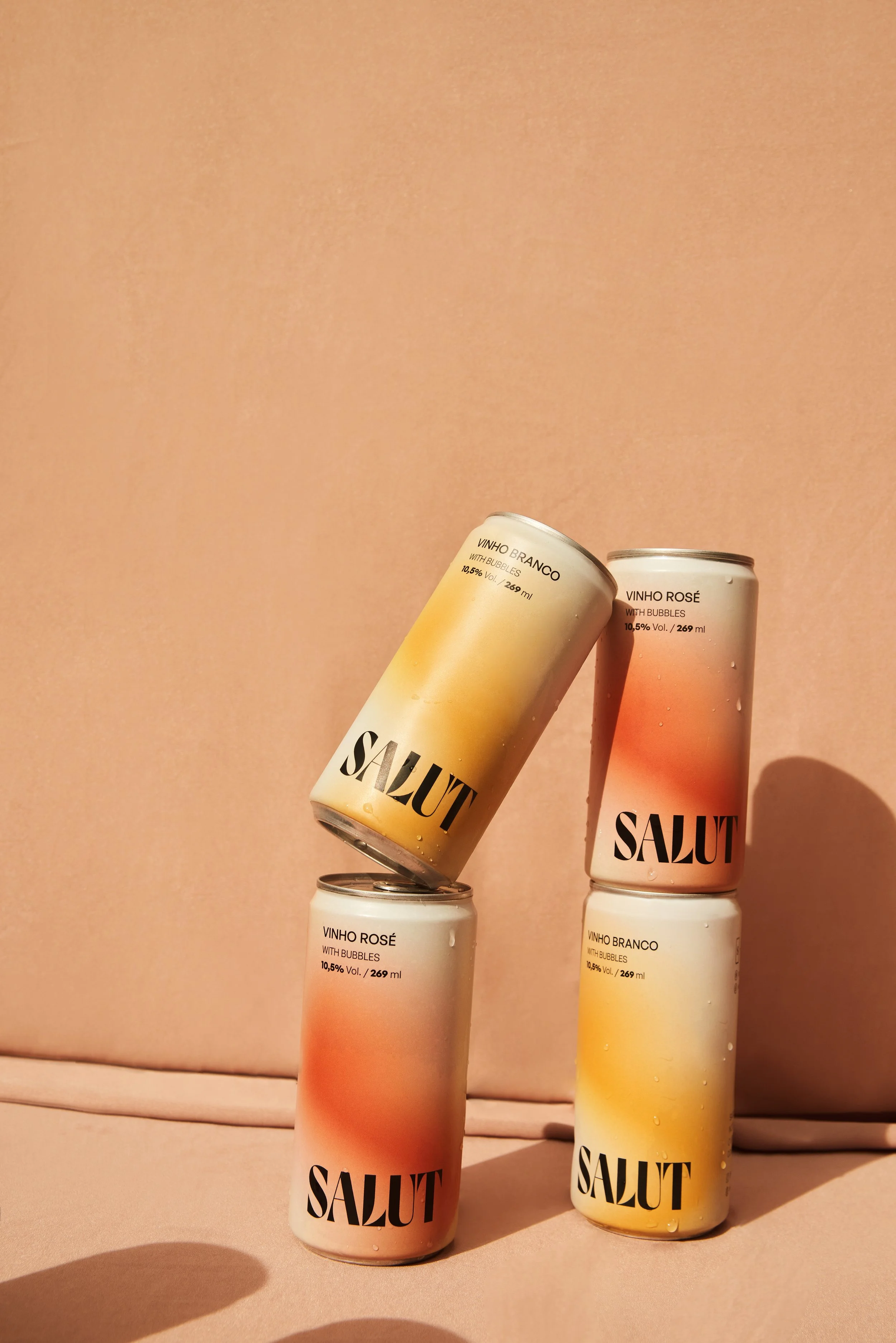


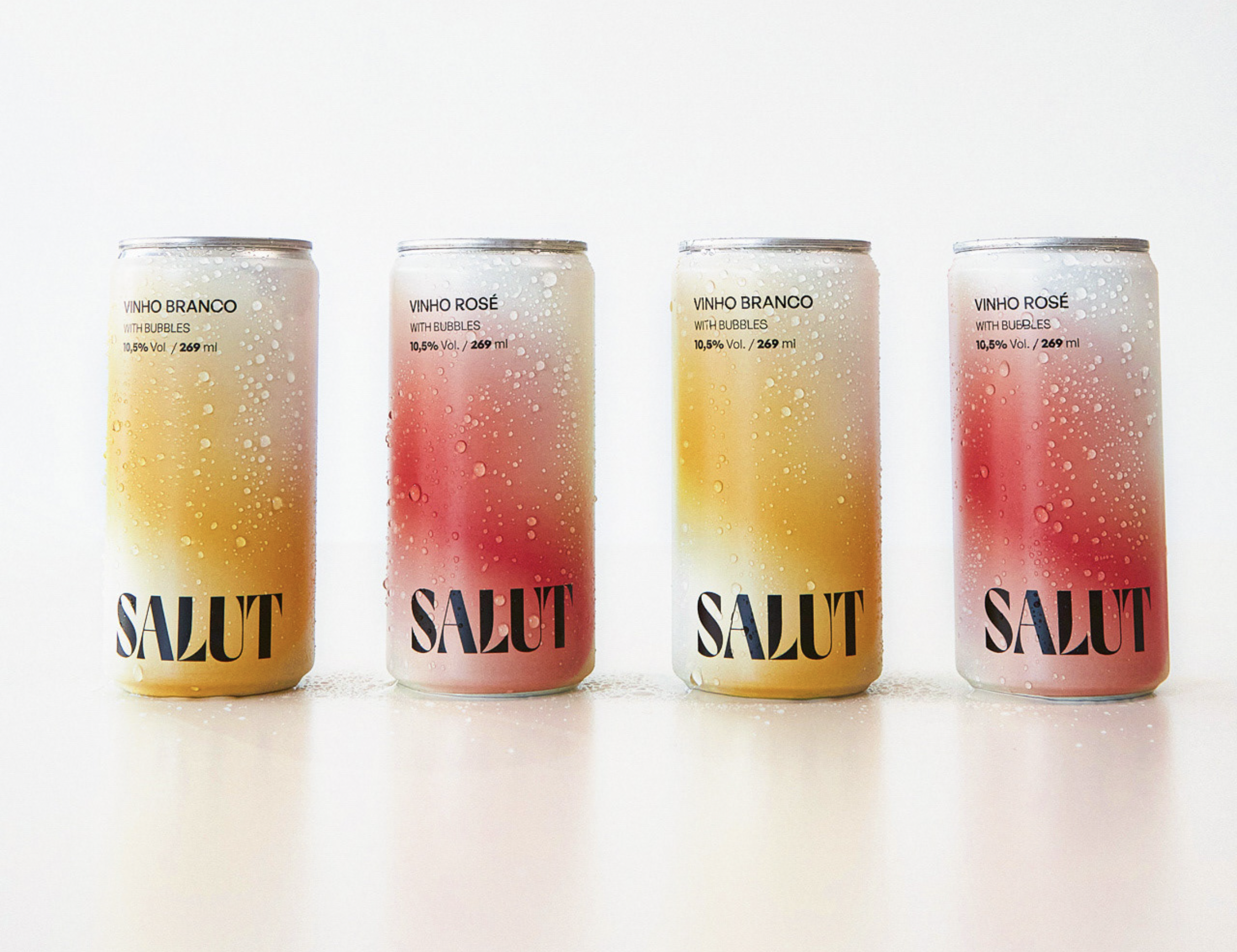
The packaging design for Salut canned wines is the perfect reflection of the brand's sophisticated and elegant image. The use of gradients in the packaging design creates a beautiful and seamless transition between the colors, which not only gives the packaging an aesthetically pleasing look, but also offers the brand flexibility to expand its flavor offerings. The design is a true reflection of the brand's commitment to quality and innovation, and is sure to catch the eye of wine lovers everywhere. Check more of the process here.
Graphic Design / Packaging / Creative Direction
Estúdio Ally Fukumoto
SALUT
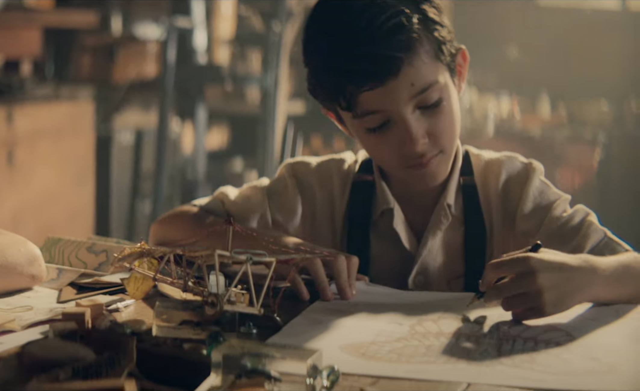
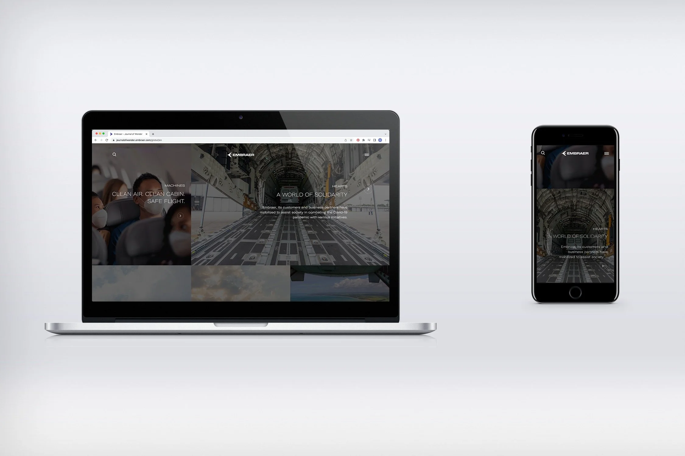
The design and art direction of Journal of Wonder perfectly captures the spirit of Embraer's 50th anniversary celebration, showcasing the company's proud history and exciting future. The website features a modern design that is both visually appealing and user-friendly, with high-quality imagery that creates a dynamic and engaging experience for readers that are in love with aircrafts.
Editorial / Art Direction / Infographics / Ui
Ideal H+K Strategies + Embraer
Journey of Wonder - Embraer

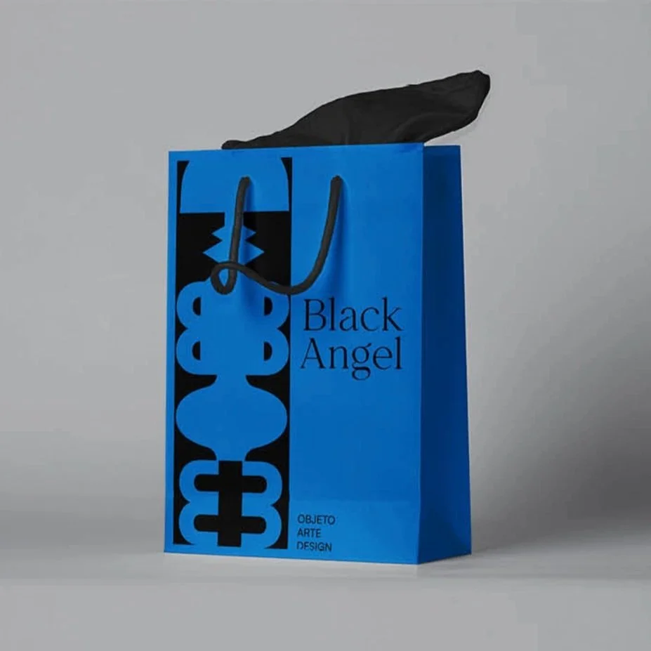
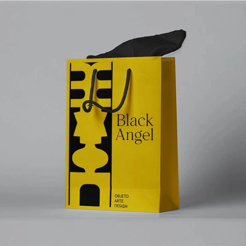
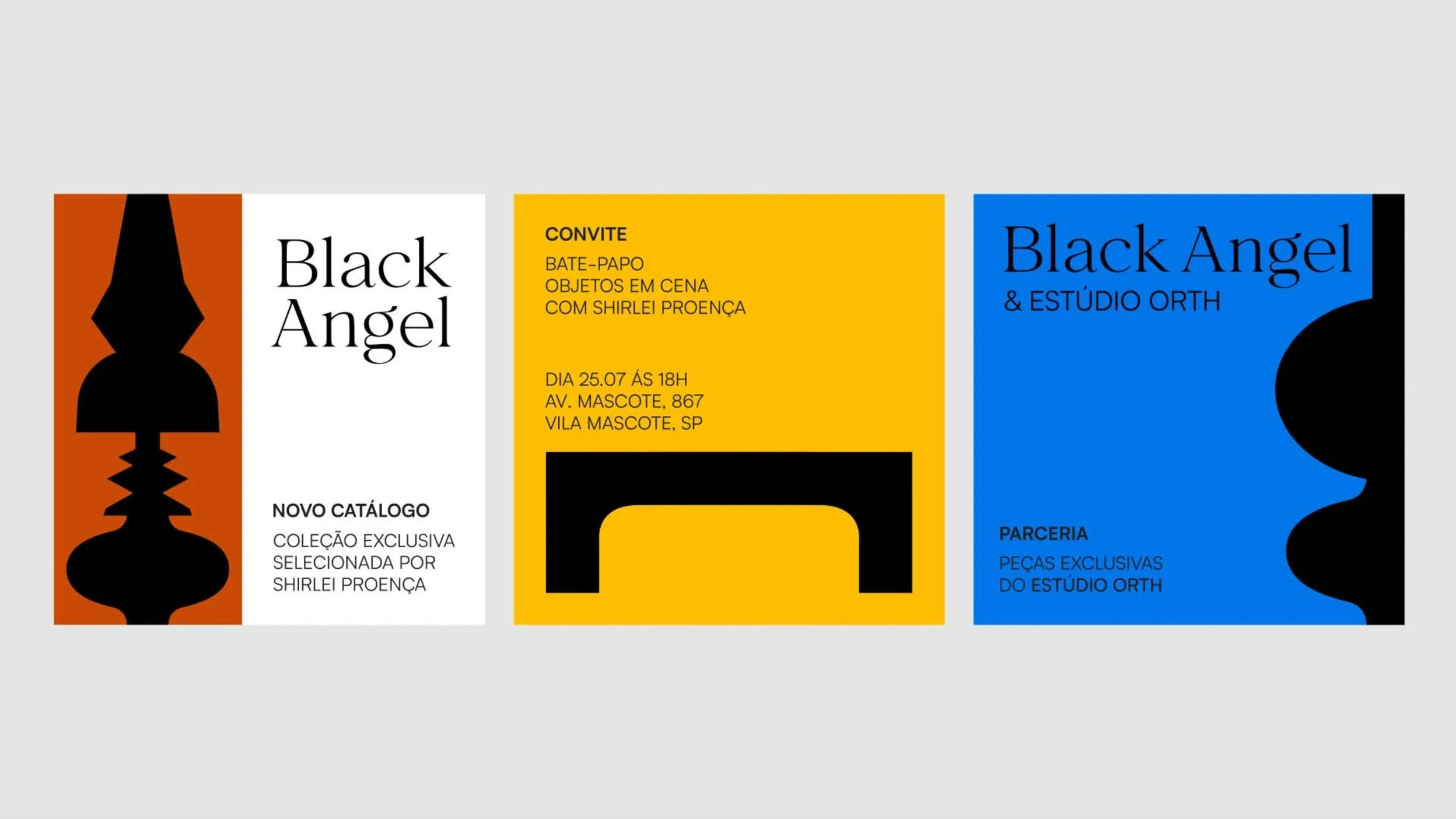

Black Angel visual identity is vibrant and colorful, perfectly suited to represent the fun and exciting atmosphere of the furniture and decoration store it represents. The brand has no symbol, but instead relies on a variety of different shapes to compose its identity. These shapes are playful and dynamic, creating a sense of movement and energy that draws the viewer in. The typography is sophisticated and clean, with a friendly and approachable appearance that invites customers to explore the store's offerings. The color palette is bright and lively, with a range of colors that evoke a sense of joy and excitement. More of this project here.
Visual Identity / Art Direction
Estúdio Ally Fukumoto
Black Angel
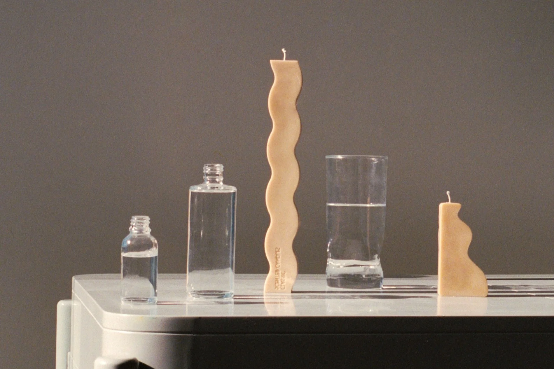
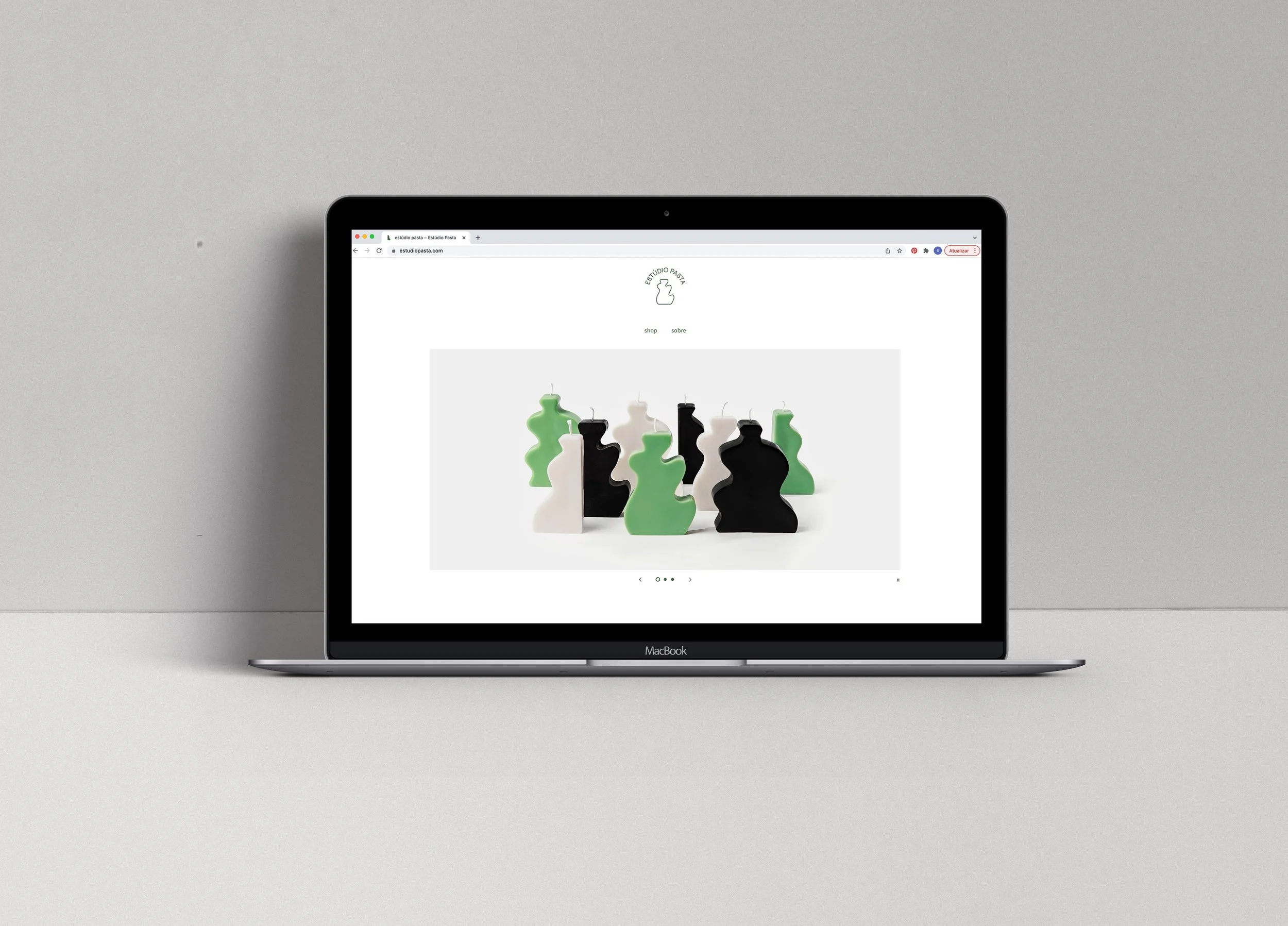
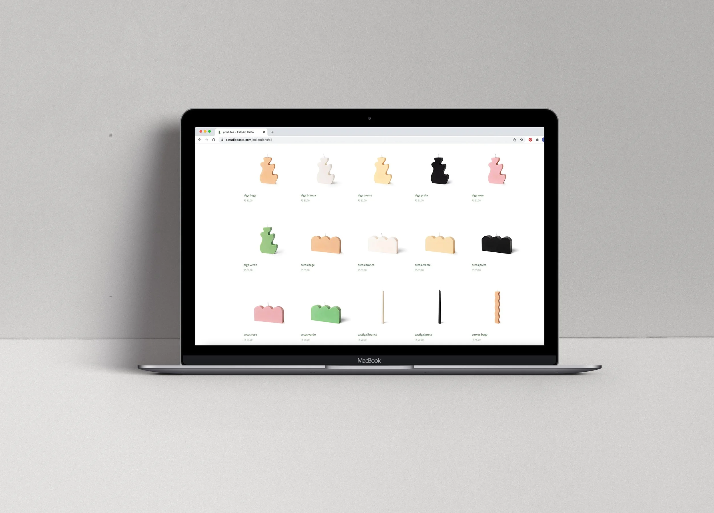
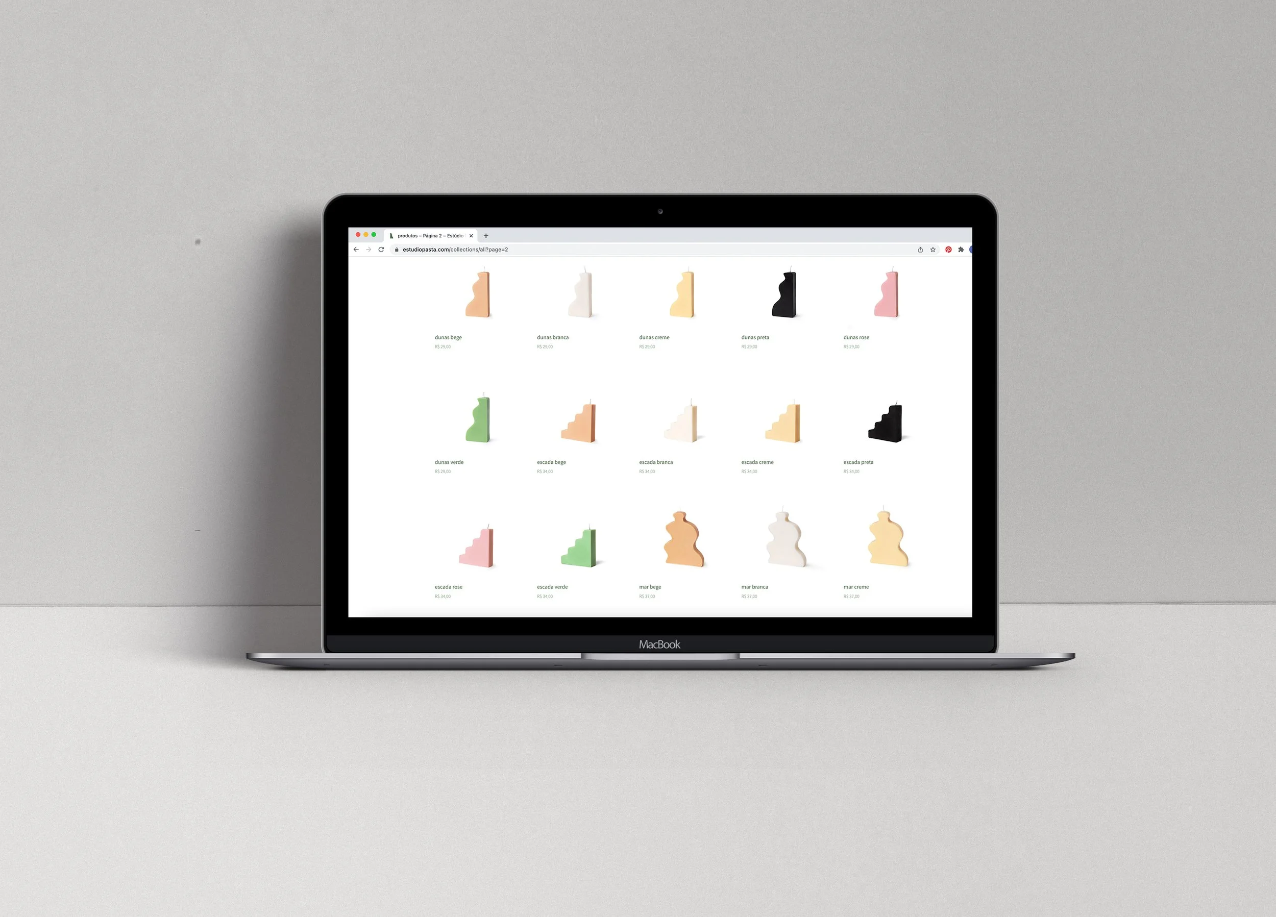
Estudio Pasta's website was created to showcase their beautiful and unique handcrafted objects and candles. The website was designed to be simple, elegant, and easy to navigate, with a clean and modern aesthetic that complements the brand's style.
Estúdio Pasta + Sophia
Web Design / Art Direction / Ui
Estúdio Pasta Website
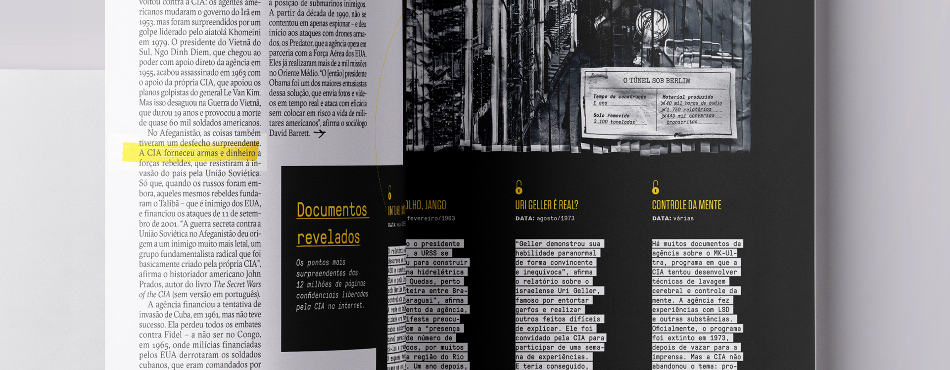
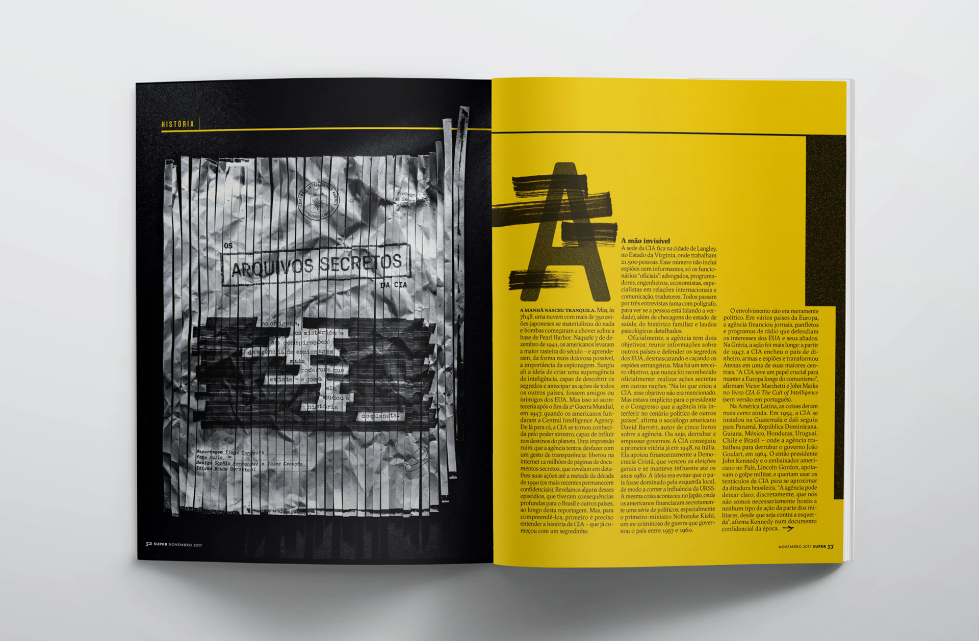
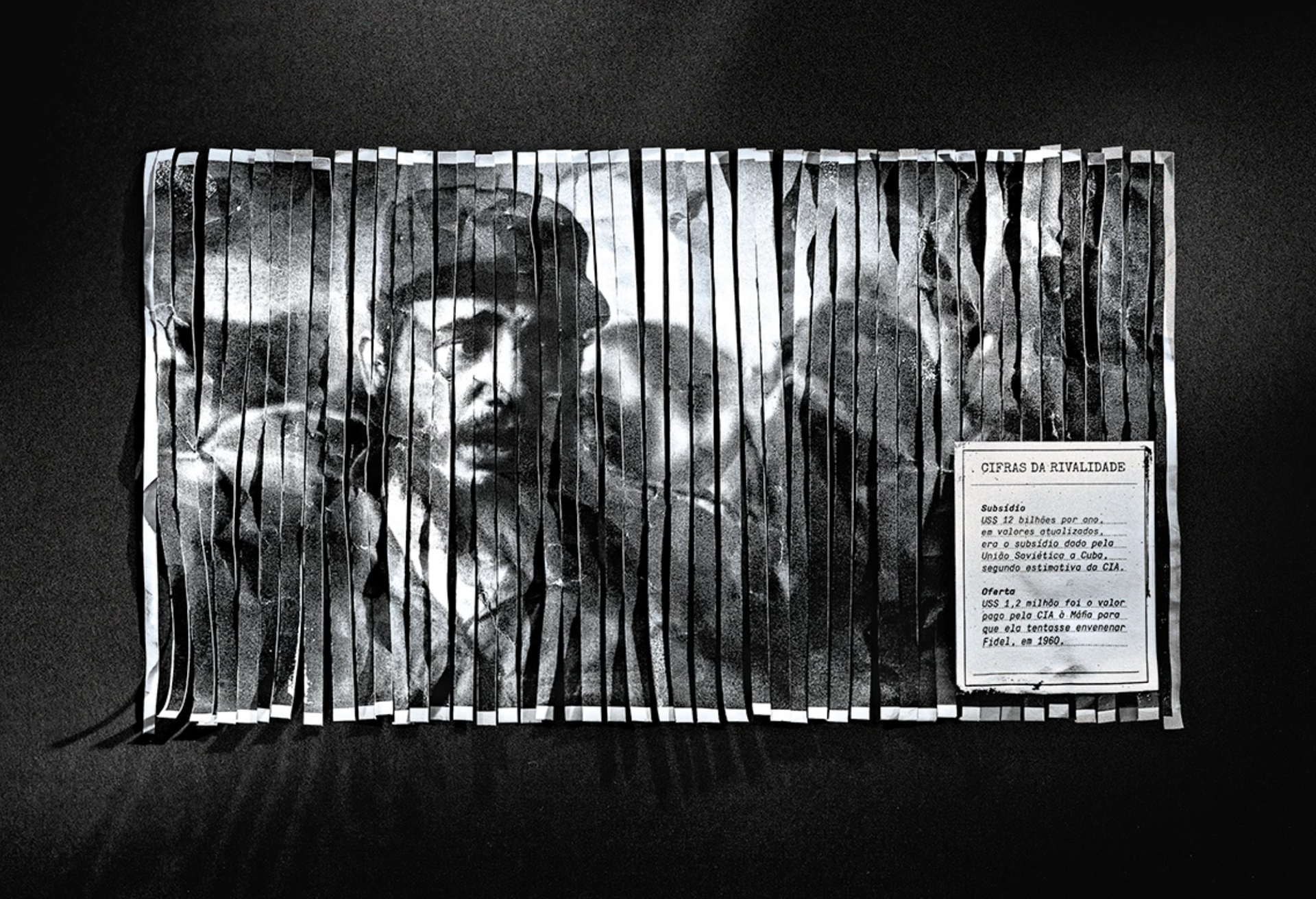
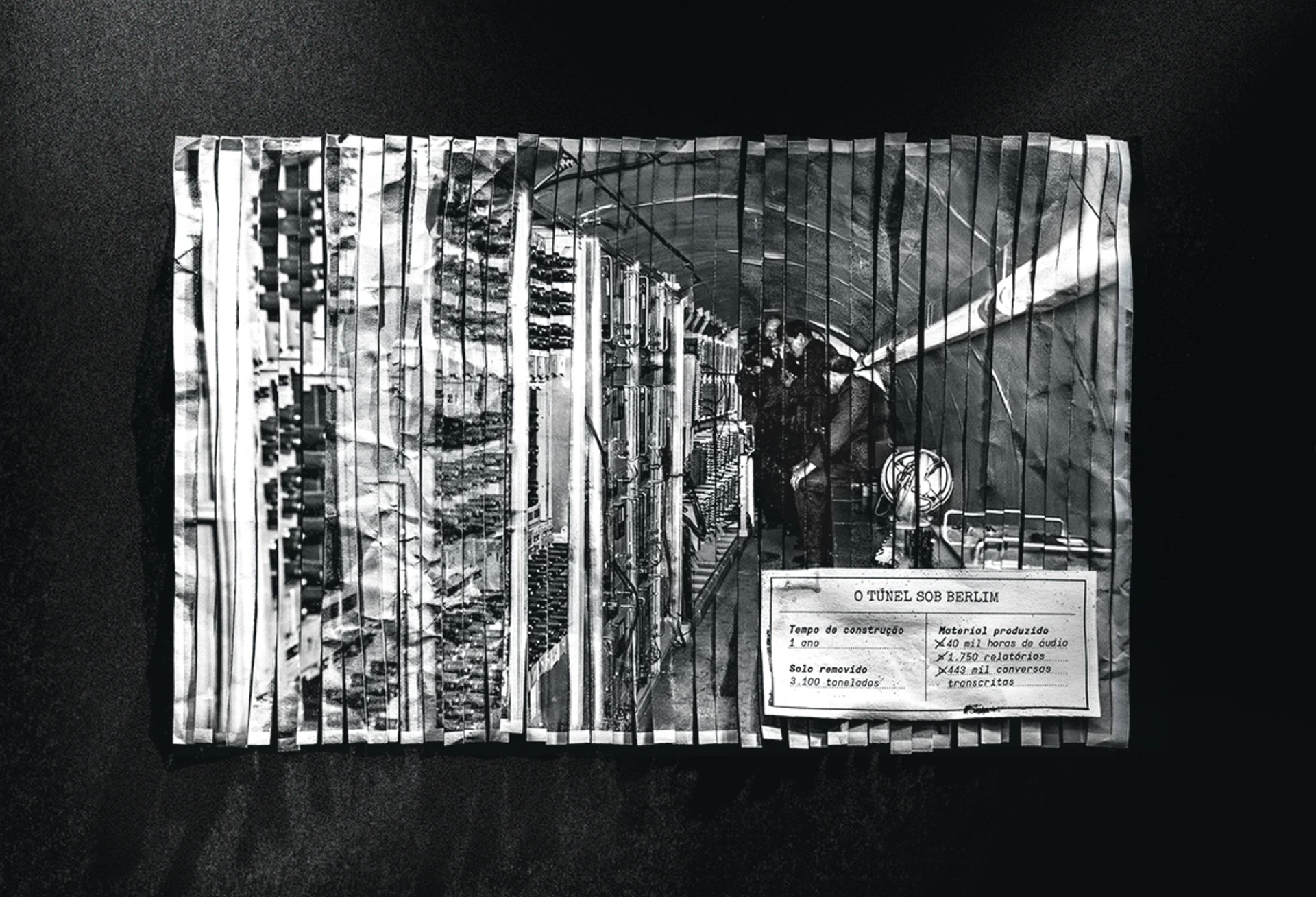
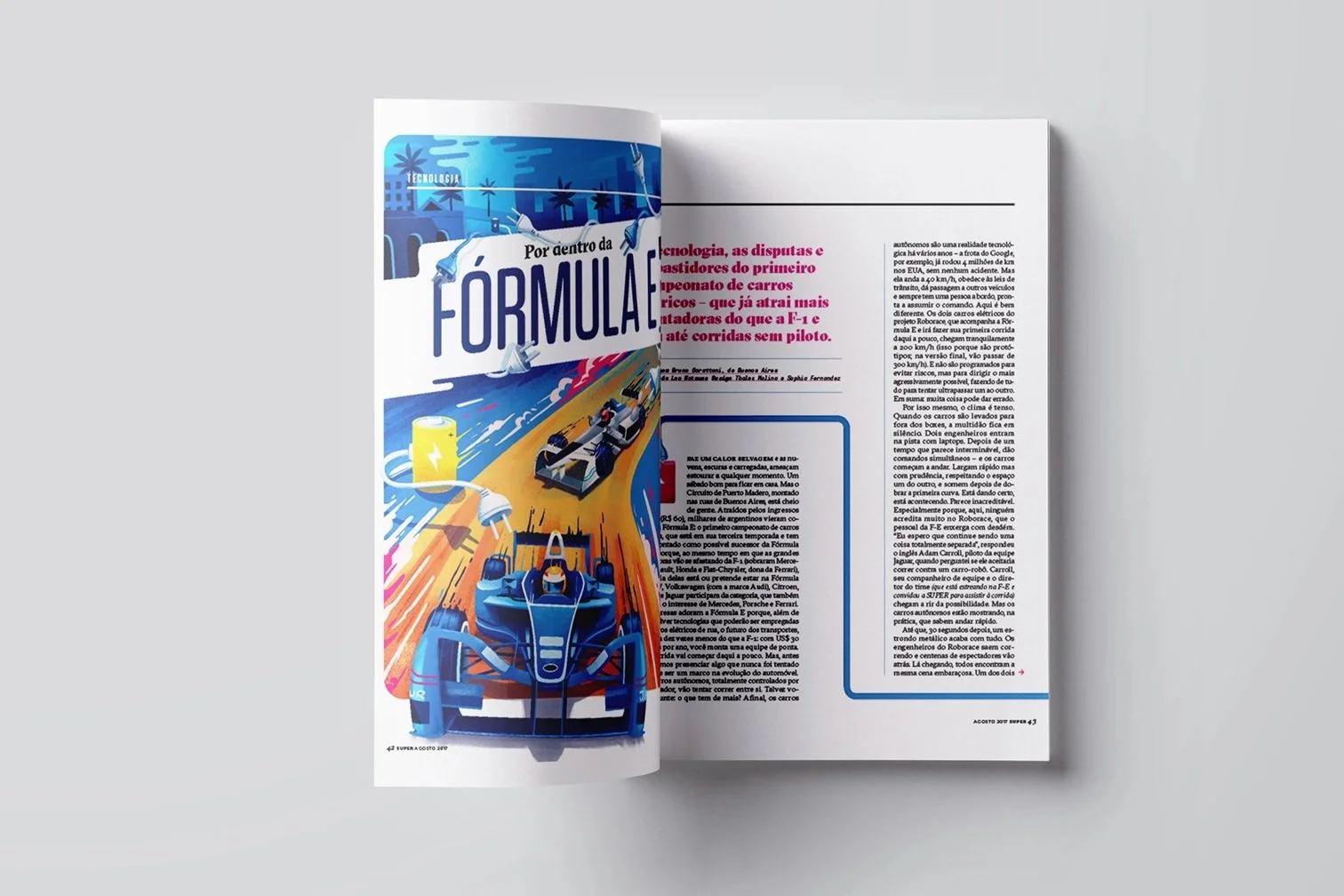
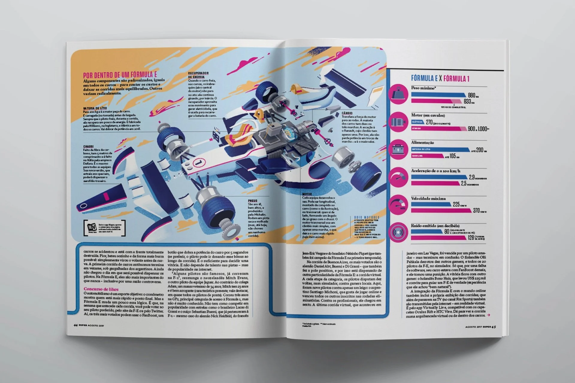
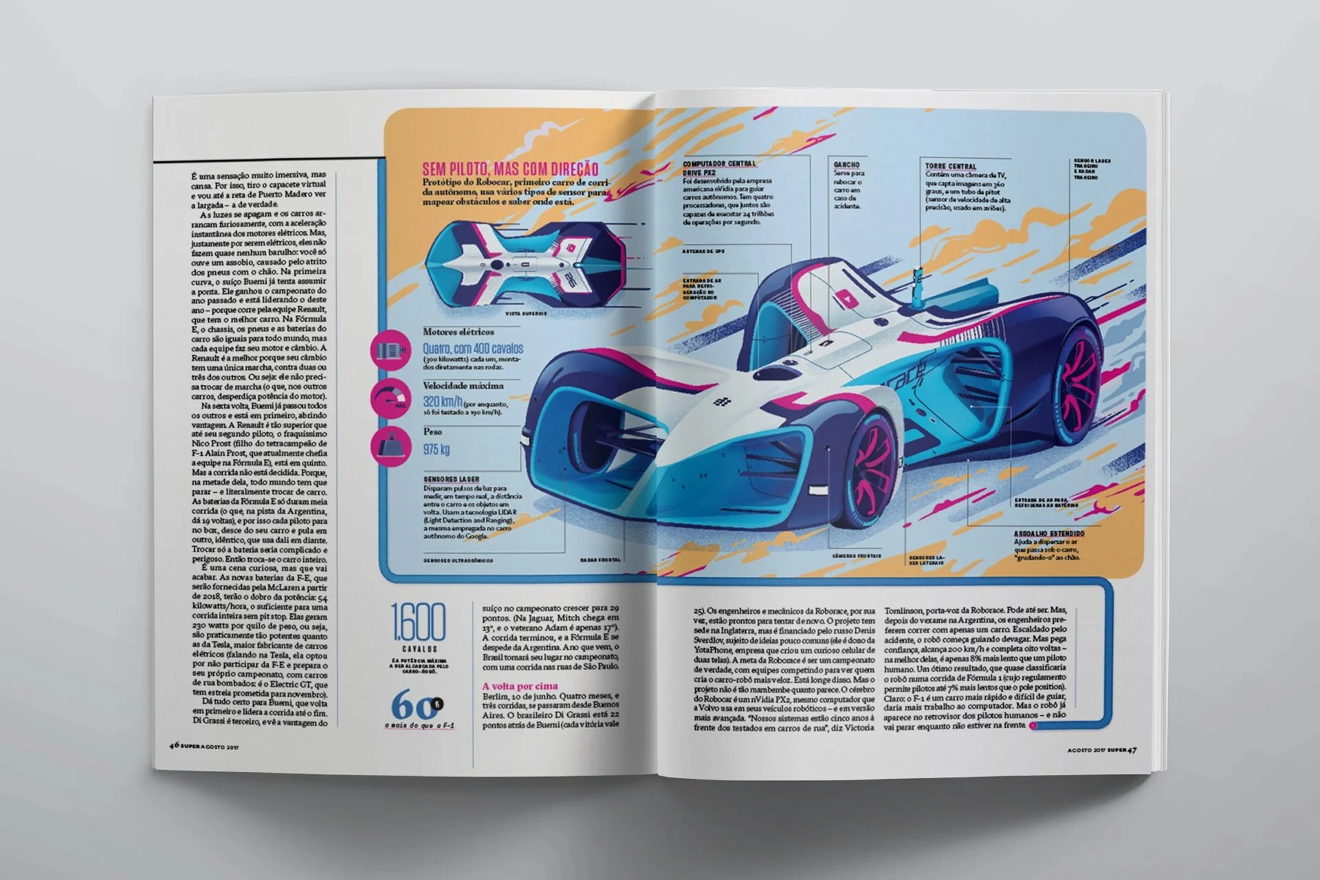
The spreads are focused on creating a visually appealing and informative graphics that uses simple language to explain complex topics to readers. The art direction is based on the magazine identity and involves fluid layouts and a variety of typography, which will help to capture the attention of readers and guide them through the content of each edition, the approach are both creative and effective.
Editora Abril - Superinteressante Magazine
Editorial / Art Direction / Infographics
Editorial Spreads
Contact via LinkedIn
oi.sophiafernandez@gmail.com
All rights reserved.
✺